by Beth Staats
Quick Summary
Gale recently added some accessibility tools to its In Context databases. Two of these, Gale in Context: Middle School and Gale in Context: High School, are available to all Minnesota residents via ELM.

Gale recently added some accessibility tools to its In Context databases. Two of these, Gale in Context: Middle School and Gale in Context: High School, are available to all Minnesota residents via ELM. In order to support the varying needs and abilities of students, Gale updated the text display features in some of its digital resources.
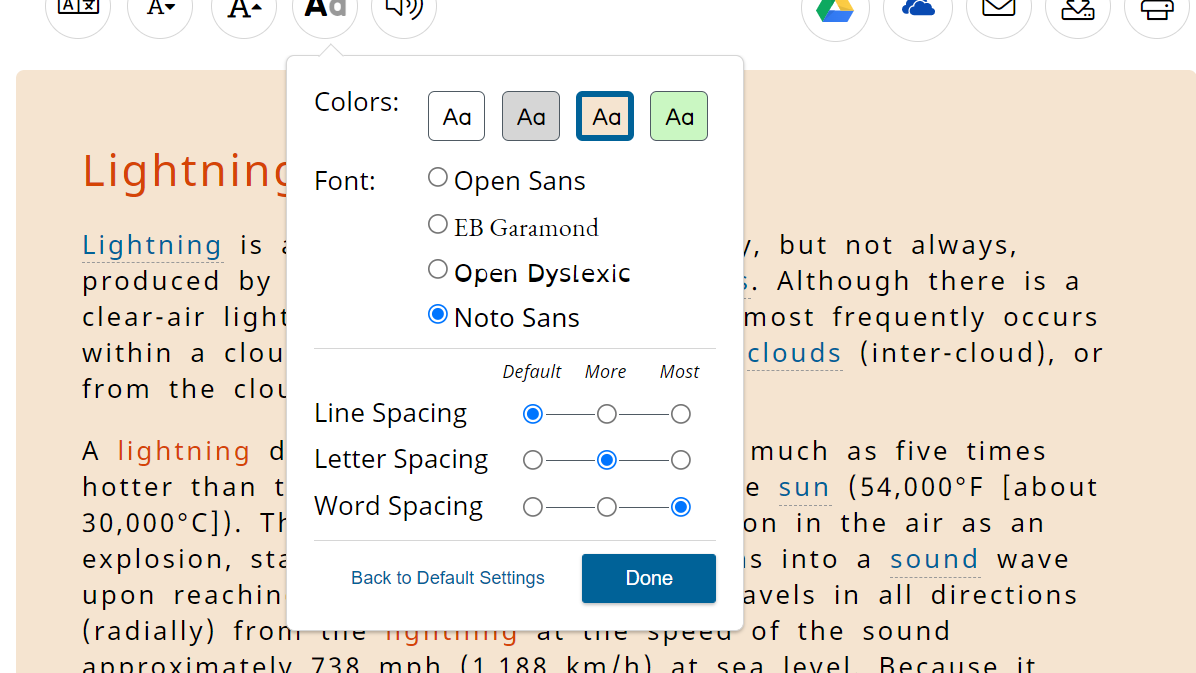
Users can now change the background color of articles so there is enough contrast between text and background. For those with low vision or other visual issues, this allows for the adjustment of contrast levels. Users must be able to perceive the content, and contrast and color are vital to accessibility.
Researchers can now also choose from several fonts including Open Sans, EB Garamond, Open Dyslexic, or Noto Sans. The Open Dyslexic font is important for a couple of reasons. It is an open-source font made to increase readability for people with dyslexia. It allows users to distinguish each individual letter while reducing errors and effort.
Lastly, researchers and students can adjust the line, letter, and word spacing of an article within In Context to choose what style is easiest for them to read.


